Product Designer & Strategist FinTech B2B SaaS 2024

ReveniQ — Revenue Analytics

Transforming how SaaS finance teams understand and act on revenue data — from complex subscription breakdowns to usage-based billing strategy.

Role
Product Designer & Strategist
Platform
B2B SaaS (Web)
Focus
Dashboard redesign · Billing strategy
Timeline
2024
Scroll
The platform
ReveniQ is a subscription analytics platform that helps SaaS finance teams understand and manage their revenue — from complex breakdowns to usage-based billing. Built for the people who live in spreadsheets, trying to make sense of multi-currency, multi-tier subscription data.
The challenge
Finance teams were spending hours each week manually reconstructing geographic revenue breakdowns in external tools. The existing dashboard lacked the hierarchy and visualisation flexibility needed to surface patterns quickly — and the billing output was incomprehensible to clients.
My role
I owned both design and strategic direction — redesigning the core revenue dashboard, conducting user research with SaaS finance teams, defining the four-zone architecture, and leading the product strategy shift toward usage-based billing with a new consolidated billing system called BilliQ.
01
Dashboard redesign

The four-zone architecture

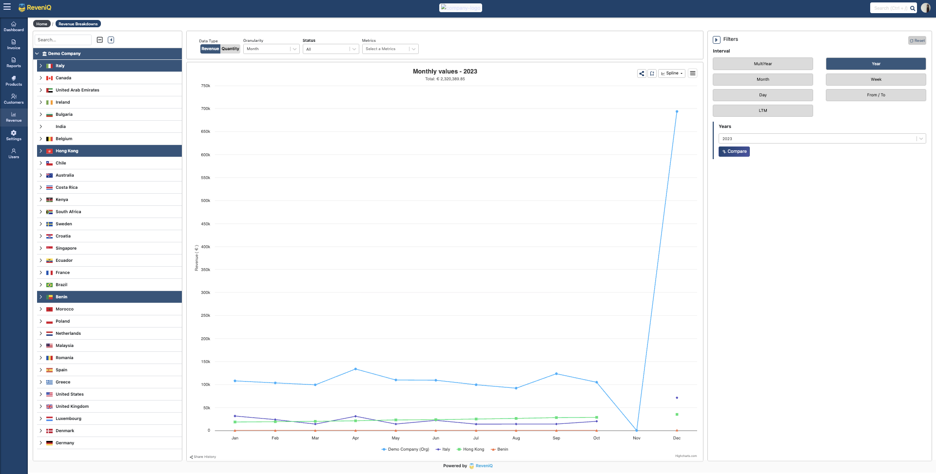
Finance teams need to move quickly between geographic views, time periods, and chart types without losing their analytical context. I redesigned the revenue breakdown dashboard around four functional zones, each optimised for a specific task in the analysis workflow.

Main dashboard
ReveniQ main dashboard view
Geographic filter
Geographic filtering view
Chart types
Multiple chart types
Time comparison
Time period comparison
💬
User research signal
“I spend 2 hours every week just trying to understand our revenue breakdown by region. We have customers in 15 countries, but I can’t easily see patterns or compare different markets.”
CFO · Series B SaaS company · Discovery interview
Zone 1 — Geographic filter
Users needed to analyse revenue at multiple geographic levels — from global overviews to specific cities — without being overwhelmed by hundreds of locations at once. I designed a hierarchical tree structure (Global → Region → Country → City) with progressive disclosure and country flags for instant visual recognition.
Zone 2 — Main visualisation
The visualisation area gets 70% of screen real estate because it’s where insights happen. Everything else exists to support this central analysis space. Responsive chart sizing, interactive tooltips, smart Y-axis scaling, and progressive rendering for large datasets — all designed to stay out of the way of the data.
Key features
Hierarchical geographic filterDrill from global to city level without losing context.
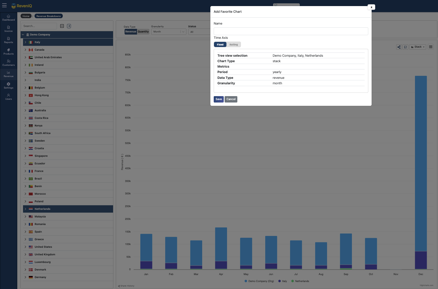
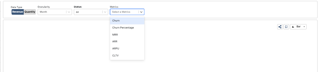
Multiple chart typesColumn, line, area, pie — switch without resetting your view.
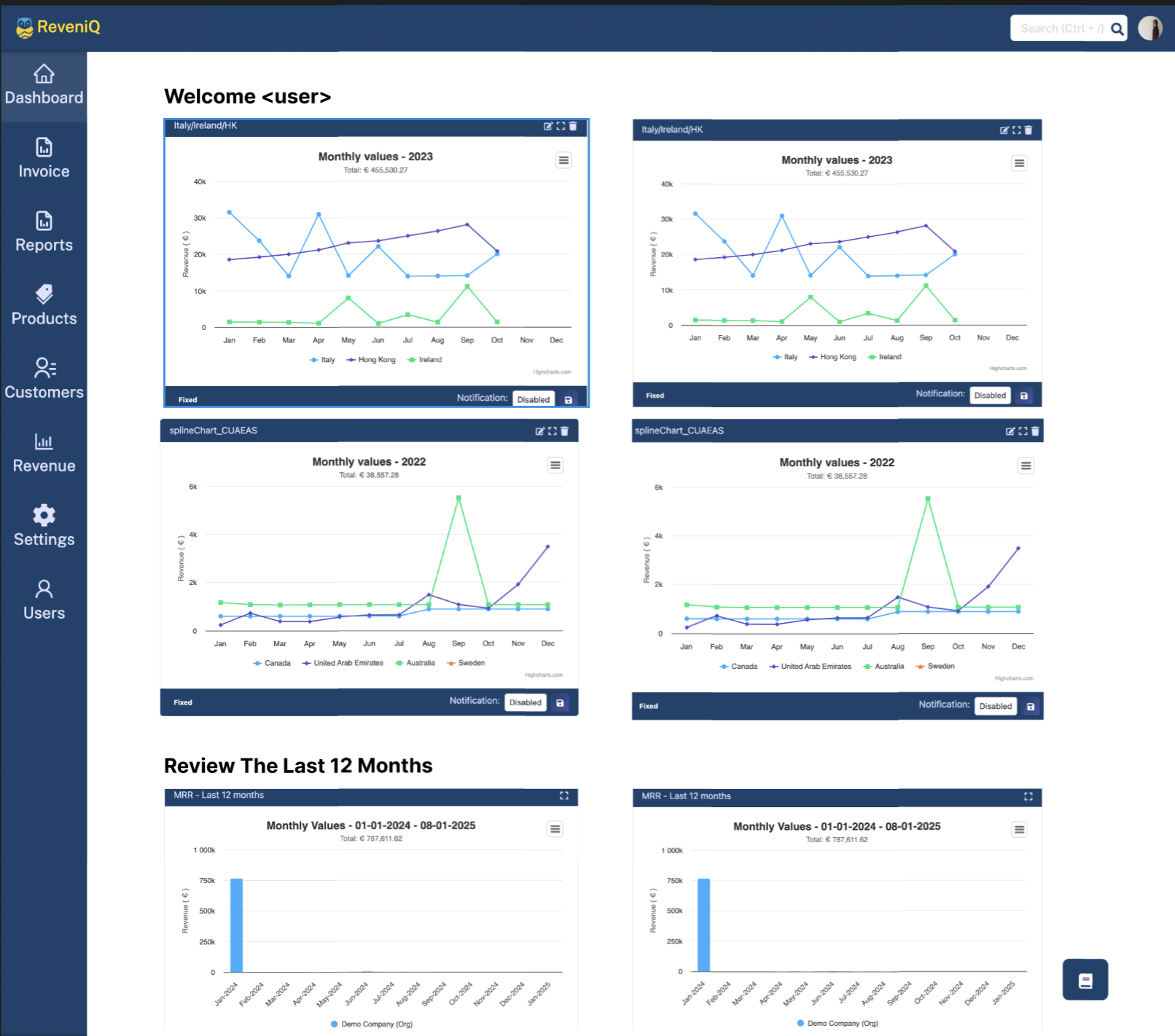
Save & favouriteStore frequently used chart configurations for recurring reports.
Time comparisonOverlay previous periods directly — daily, monthly, or yearly.
02
Product strategy · BilliQ

Pivoting to usage-based billing

Beyond dashboard design, I led the strategic shift to incorporate usage-based billing capabilities. Managing multiple prorata charges was creating a nightmare for finance teams — cluttered invoices, reconciliation errors, and clients who couldn’t understand their own bills. BilliQ was the answer.

âš¡
Strategic opportunity
“Designing a credible, buildable product strategy before the engineering investment is committed requires product thinking that goes well beyond visual execution — it’s about understanding the business model shift, not just the interface.”
Design approach · ReveniQ billing strategy
The problem
Cluttered invoices with dozens of prorata line items were creating a dual problem: accountants spending hours reconciling usage charges, and clients receiving incomprehensible bills that eroded trust. The existing system exposed all the complexity of the backend — exactly what end users shouldn’t see.
BilliQ — the solution
I designed a system that consolidates varying prorata charges into a single, clear line item on each invoice. Rather than exposing billing infrastructure, BilliQ gives finance teams a clean summary view with drill-down available for those who need the detail — clarity as the default, complexity on demand.
Four design pillars
ClaritySimplified billing statements anyone can understand at a glance — no accounting background required.
Time savingsReduced reconciliation time for accountants by consolidating charge types.
Accurate reportingTransparent invoices that map directly to financial reporting structures.
Better client experienceBills that clients can actually read — reducing support overhead and building trust.
Impact

What this project delivered

01 —
91% user satisfaction
91% of users reported improved ability to analyse geographic revenue patterns after the dashboard redesign.
02 —
67% faster reporting
Reduction in time finance teams spent creating board reports — from hours to minutes with saved chart configurations.
03 —
Usage-based billing launched
BilliQ successfully launched and adopted by key customers — from strategic concept to production feature.
04 —
Market positioning
Established ReveniQ’s competitive position in the usage-based billing market, differentiating from legacy analytics tools.

Liked what you saw?
Let’s build something together.

Get in touch →